Scope of work

Advertising

Brand Identity

Editorial & Books

Environmental Design

Social Media

Credits

Dean Mackenzie (Photography)

Orion owns and operates the electricity distribution network that powers central Canterbury, delivering electricity to more than 207,000 homes and businesses across an 8,000 square kilometre network. In 2015, we partnered with Orion to develop a new brand identity that reflected its role as both a critical infrastructure provider and a trusted community organisation. More than a decade later, we continue to work closely with Orion’s communications team, helping evolve and apply the brand across a wide range of touchpoints.
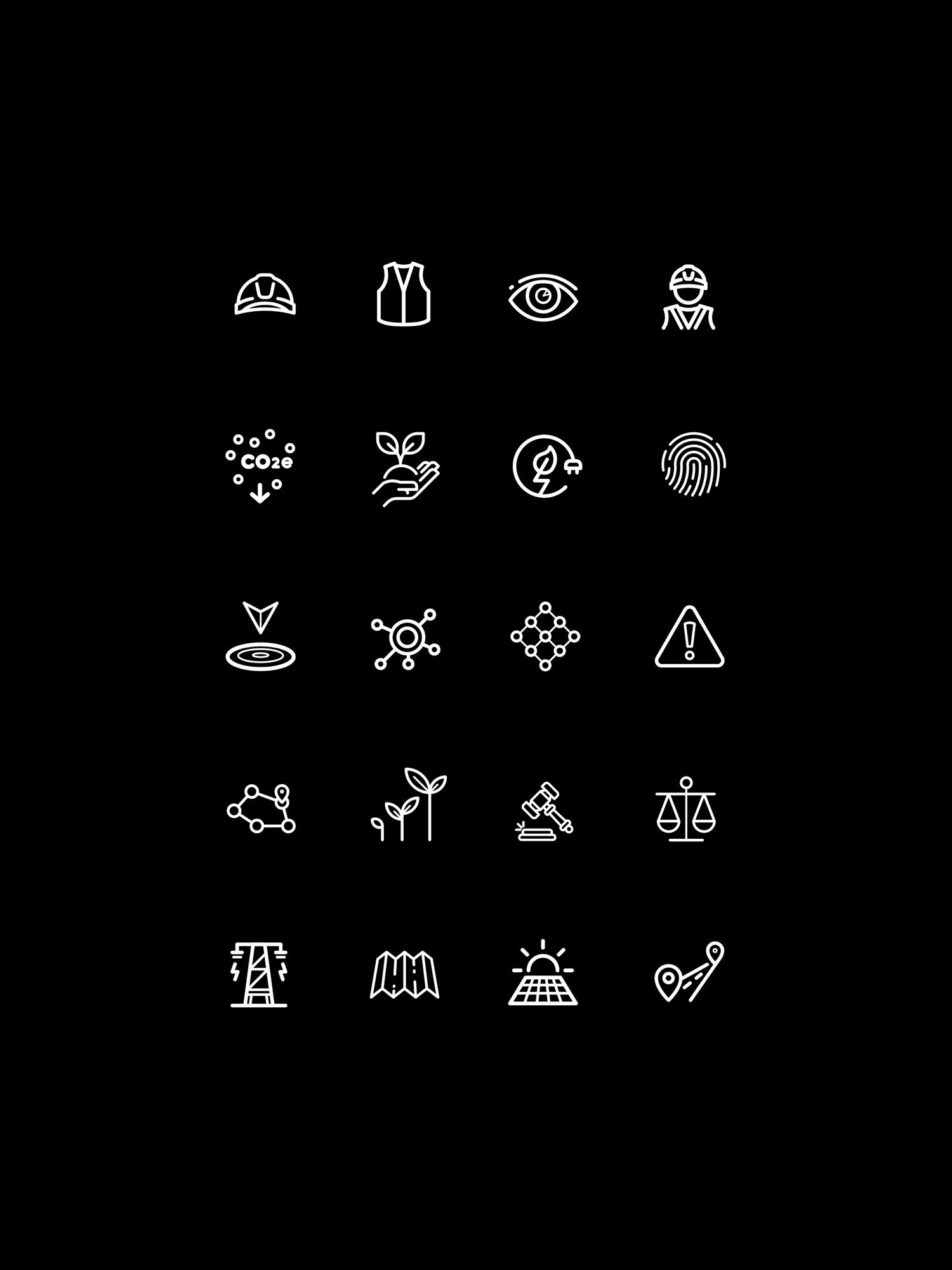
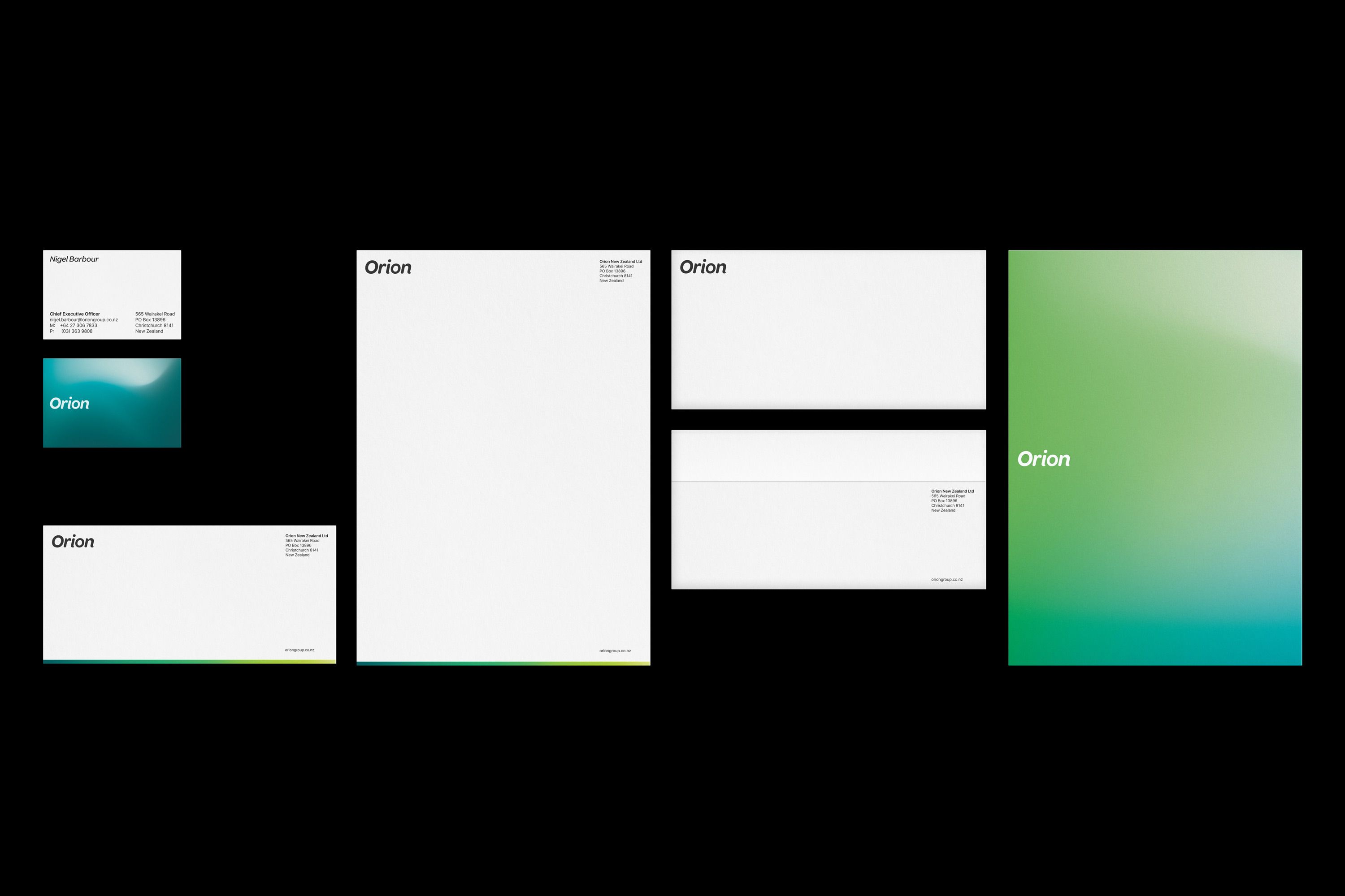
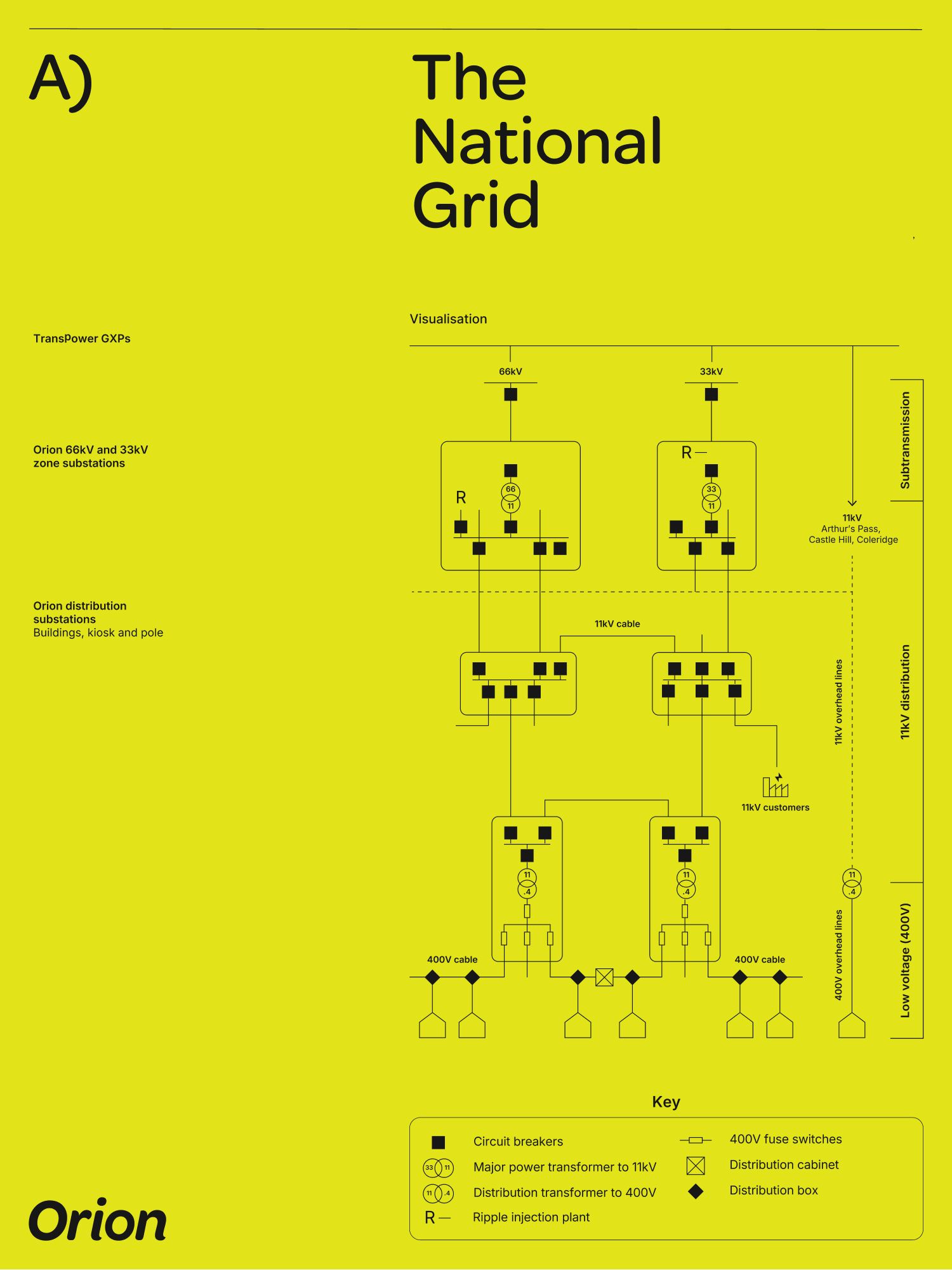
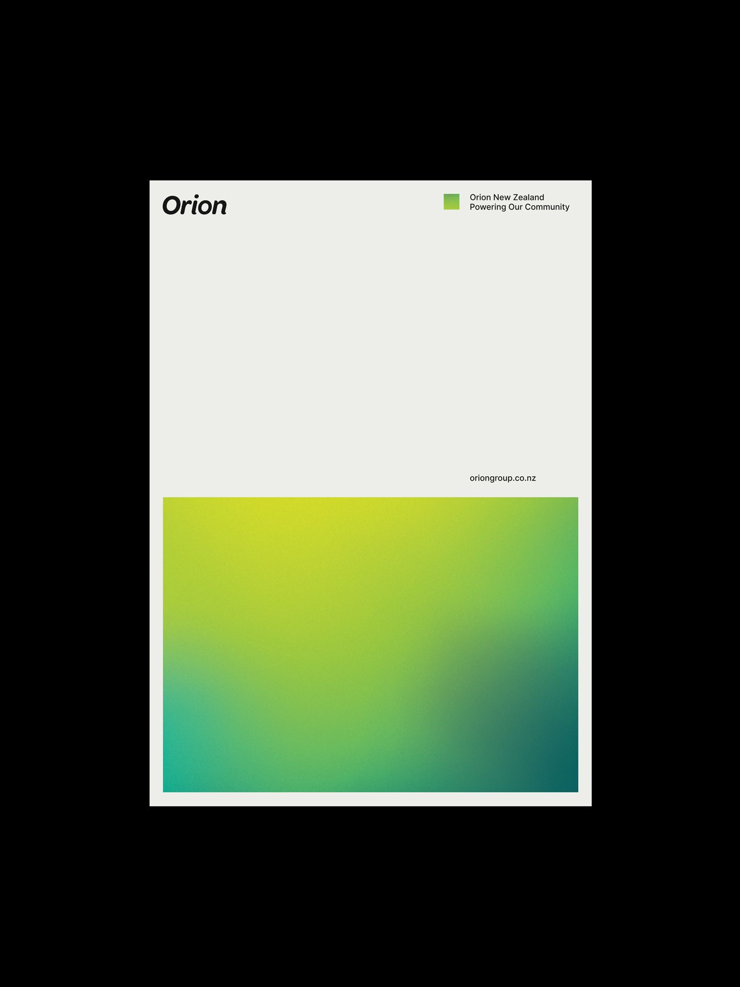
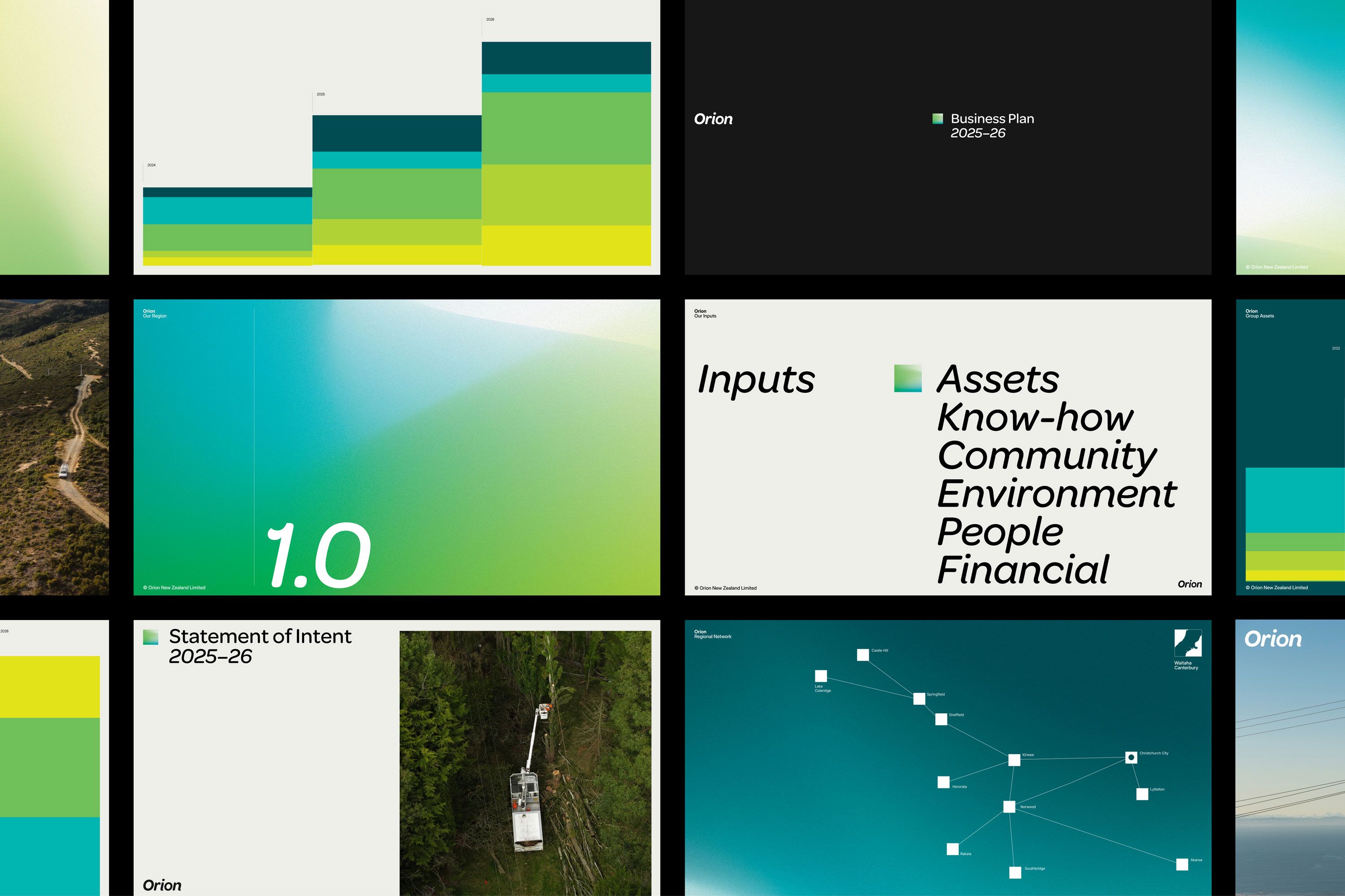
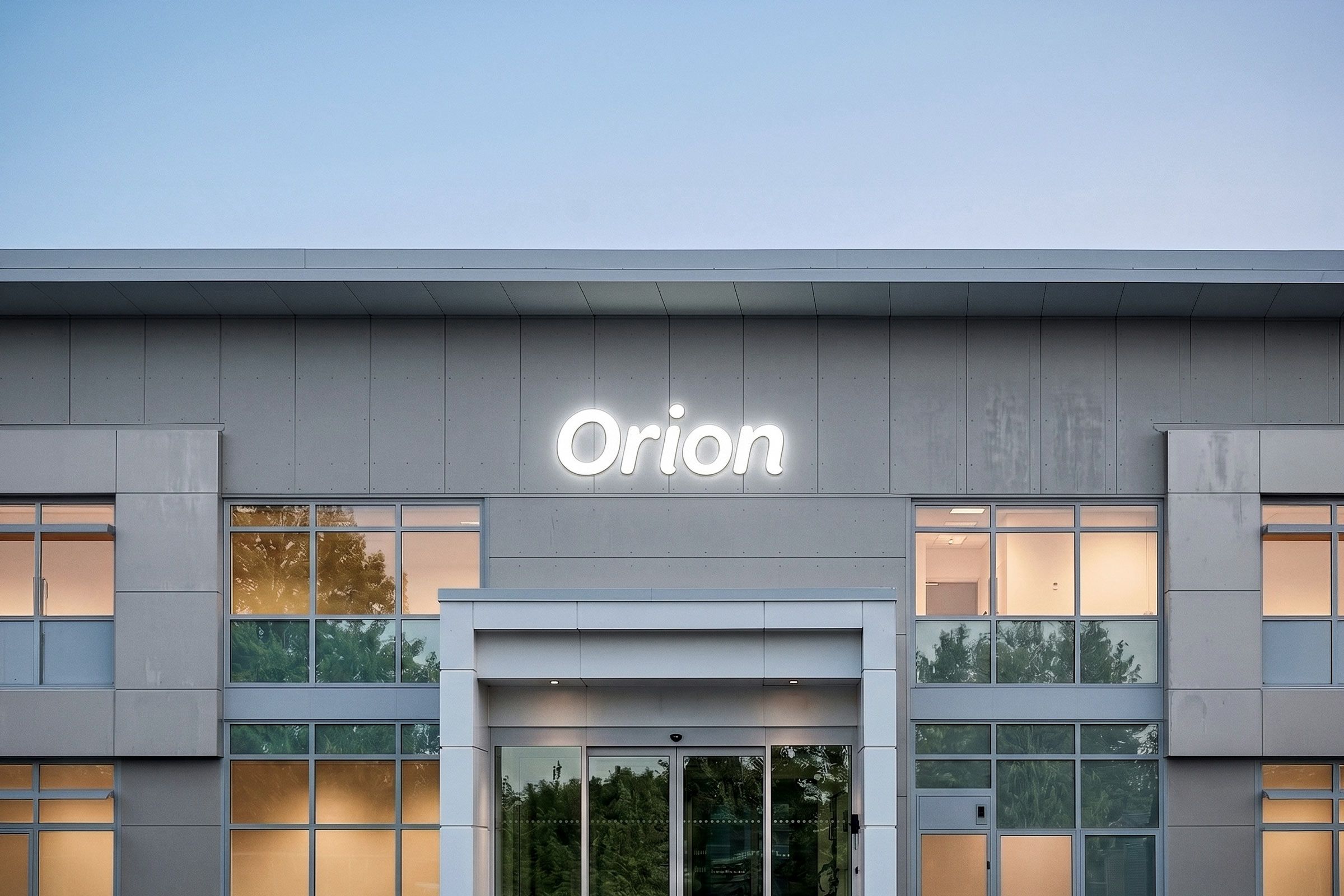
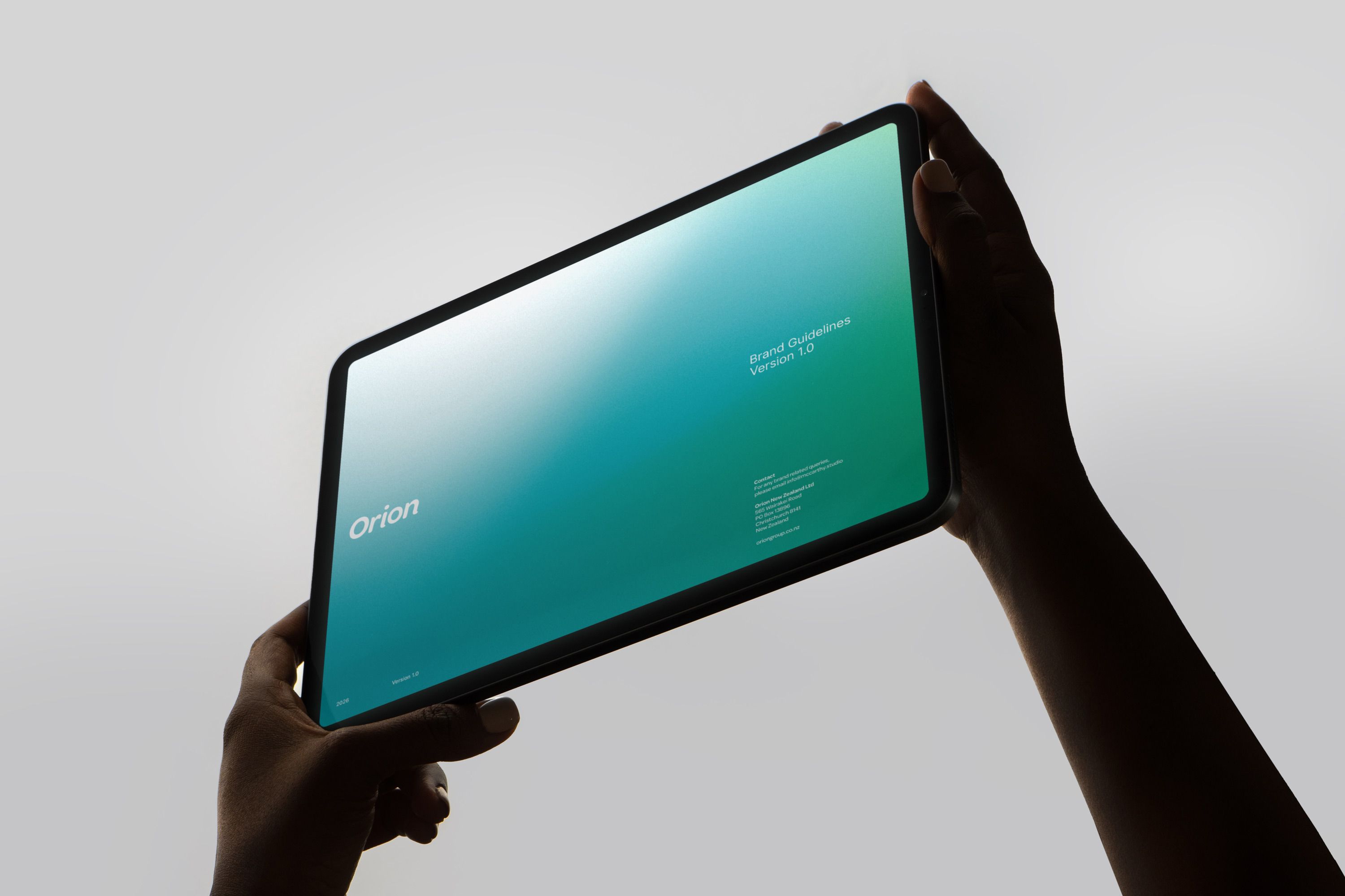
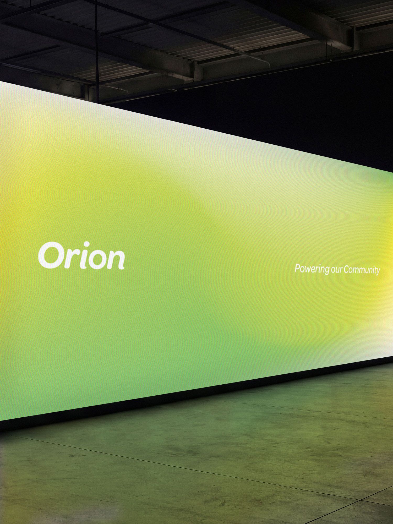
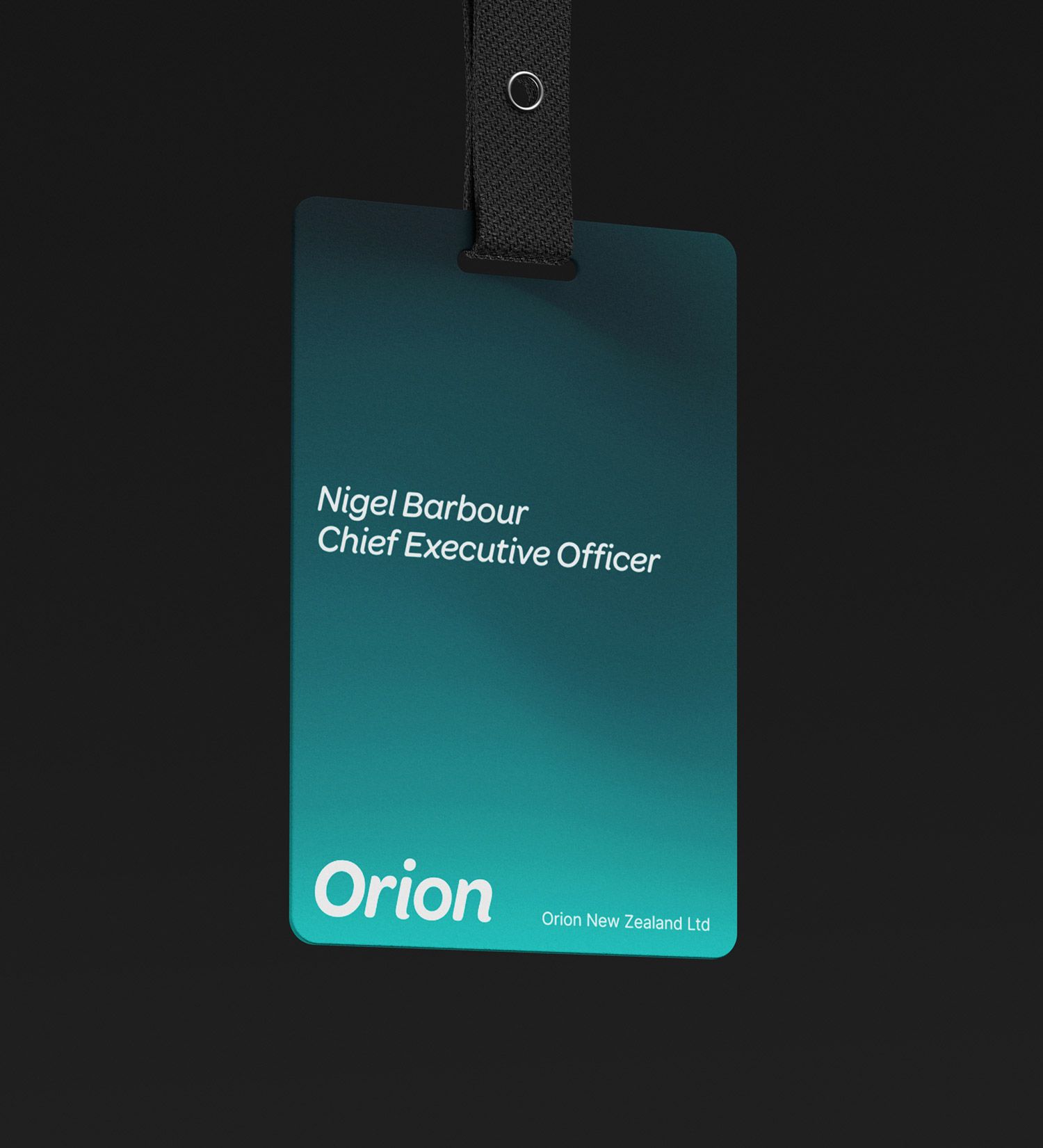
The identity is built around Orion’s positioning, Powering Our Community. A rounded italic wordmark creates a sense of approachability and movement, balanced by a strong sans-serif typeface that reflects the organisation’s technical expertise and operational strength. A vibrant colour palette and dynamic gradients evoke energy and connectivity, while a structured graphic system draws on data visualisation and network thinking to communicate the complexity of the electricity network in an accessible way.

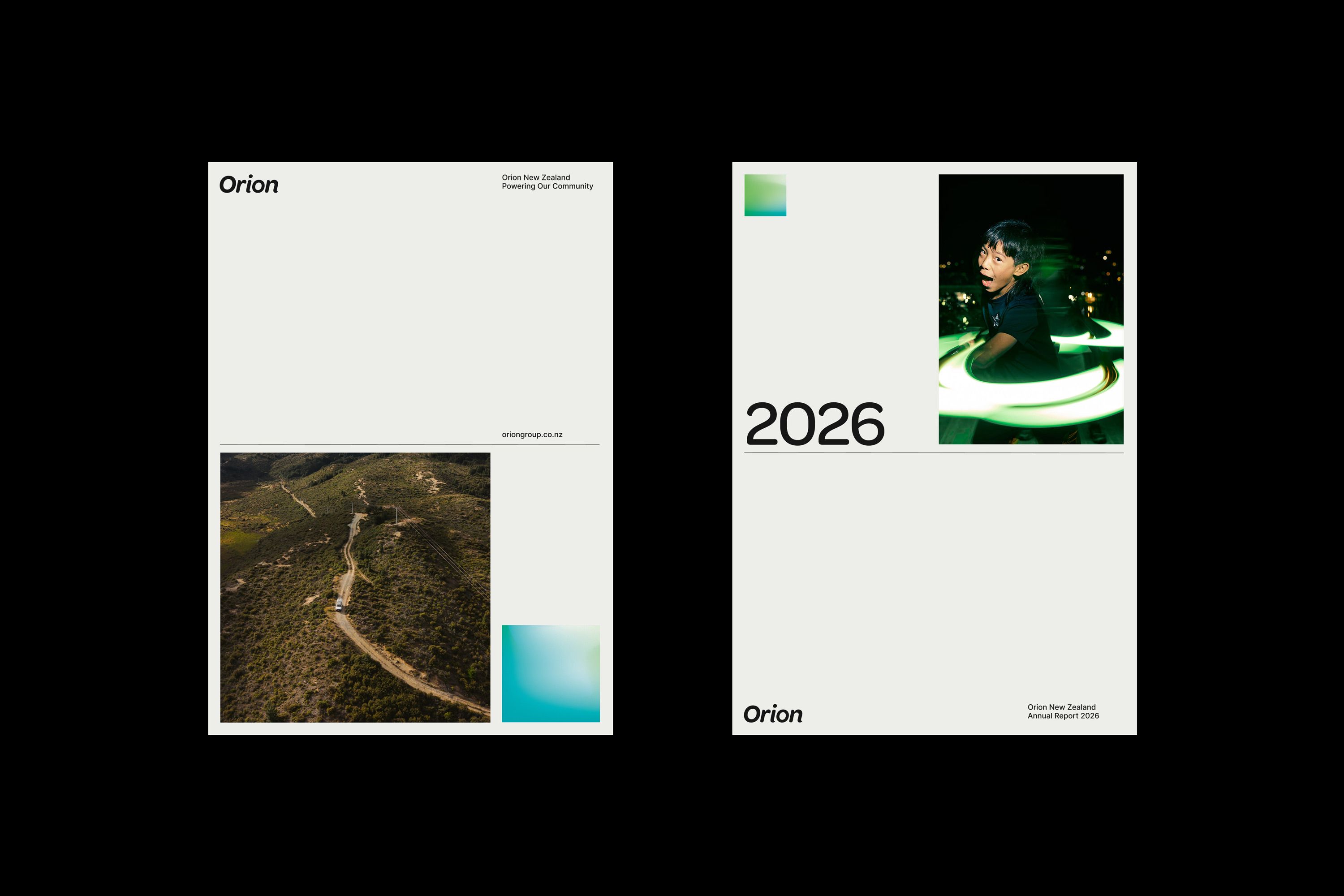
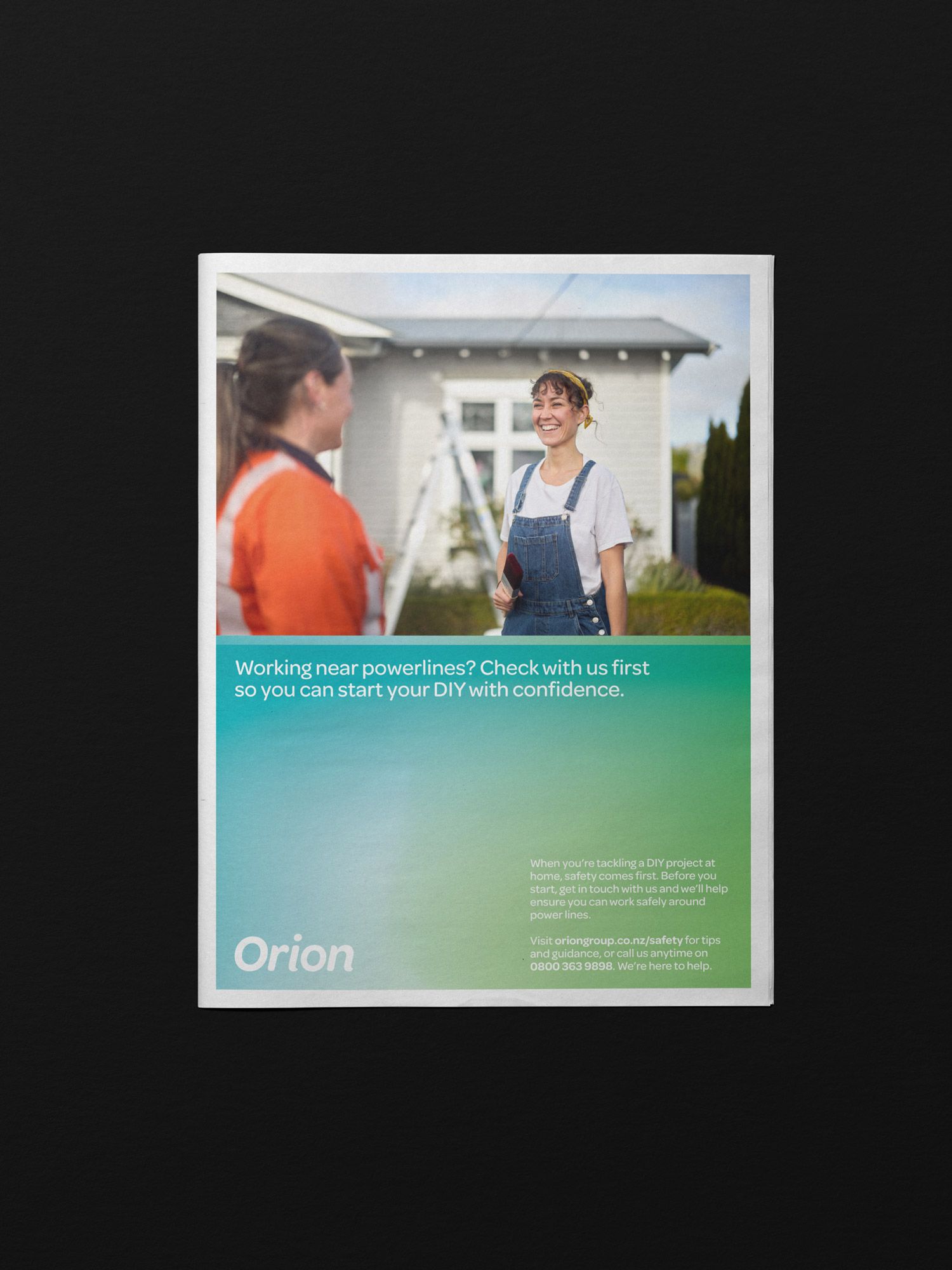
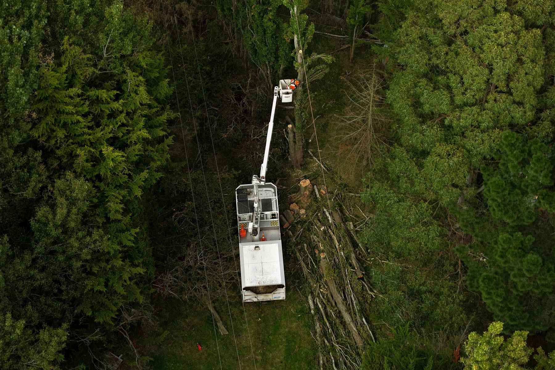
Across communications, this balance of warmth and precision is brought to life through thoughtful composition, clear information design, and photography that captures both the people behind the network and the communities it serves. The result is a brand that feels confident, human, and distinctly Canterbury, supporting Orion’s ongoing role in powering and connecting the region.